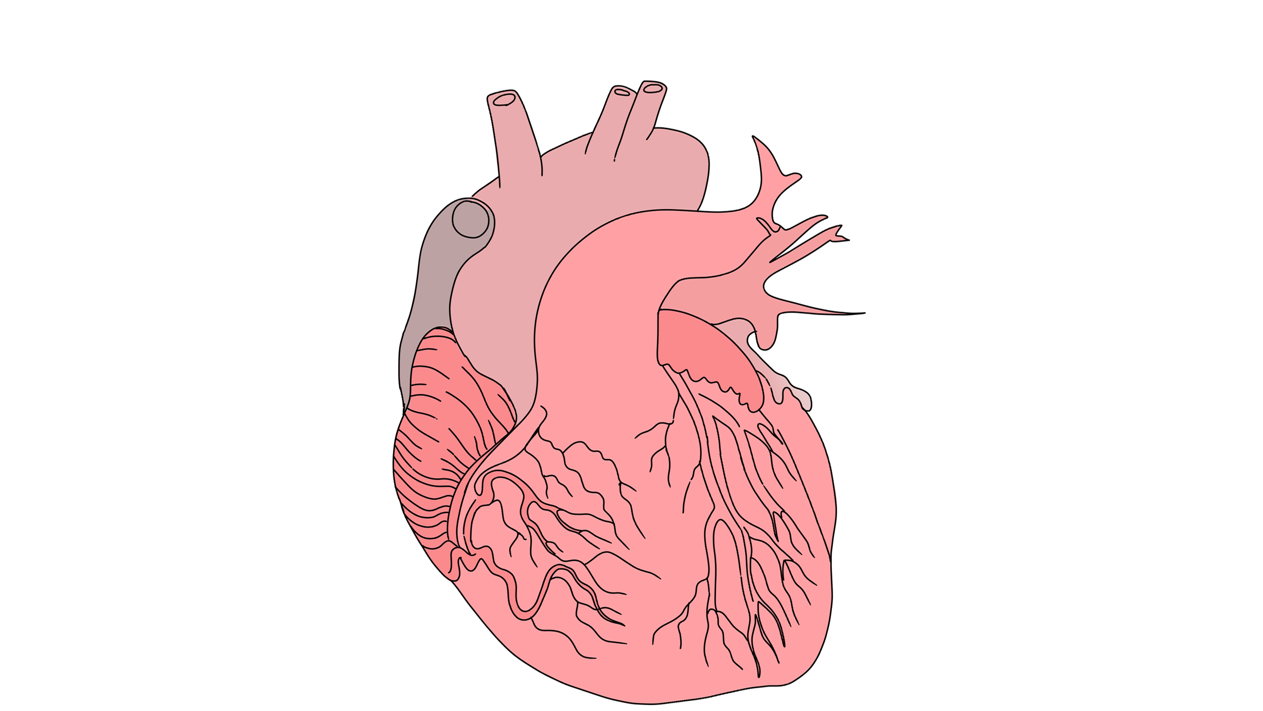
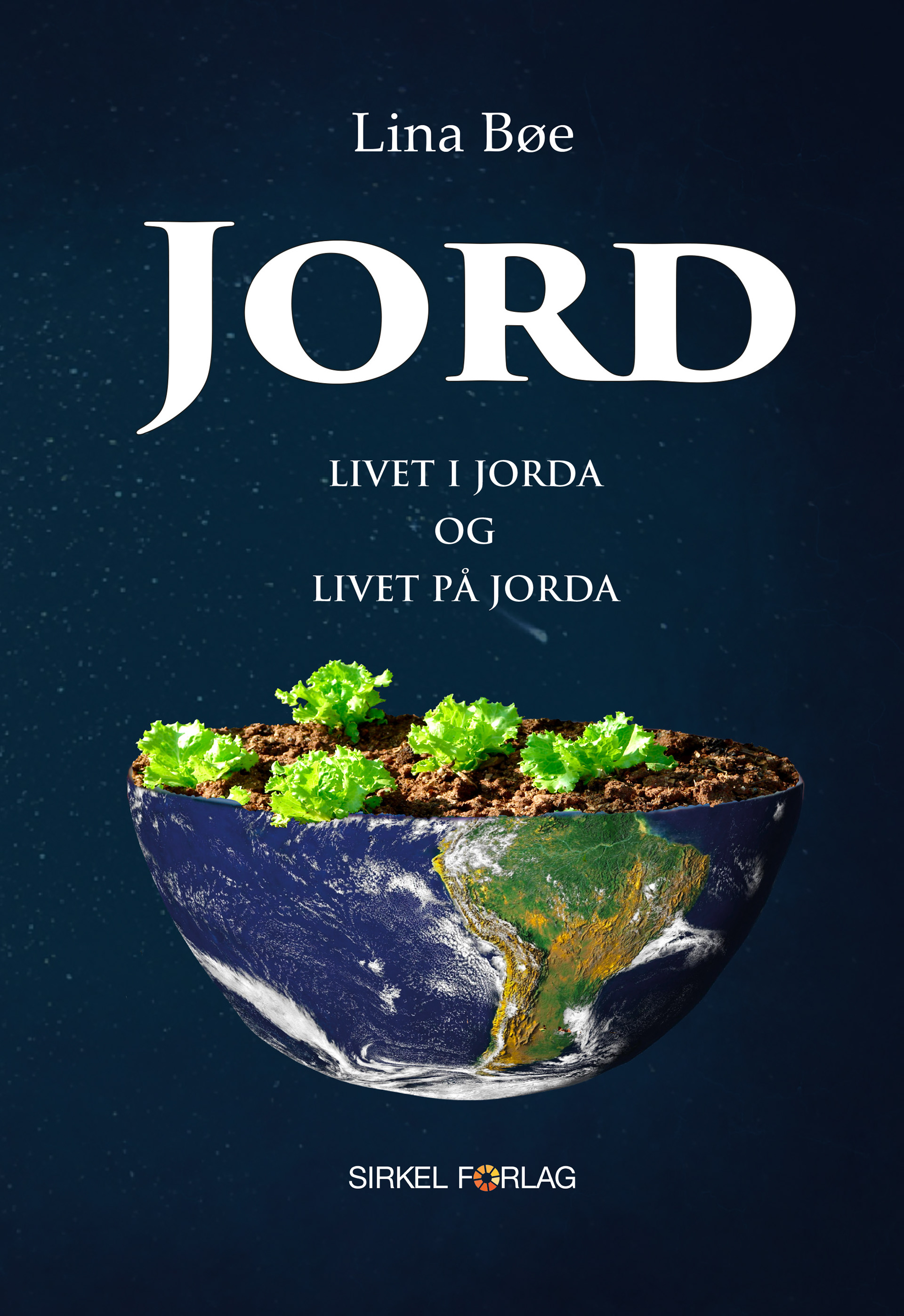
Compositions of all illustrations created for the book "Jord, livet i jorda, livet på jorda". The challenge and task was to create a sense of harmony between the two styles. To achieve this, I used a warmer color palette, such as orange and yellow, to represent the South American style, and cooler colors, such as blue, to represent the Scandinavian style. I also focused on adding many different plants to create a sense of harmony and jungle feeling. The most important element in all illustrations was the soil. To expose it, I used a special technique of creating straight brown-yellow gradients of lines that separate the soil from the rest of the illustration.
the book "Jord, livet i jorda, livet på jorda" is available on sale in Norway.
If you click on the picture above, it will take you to the ARK Bokhandel website.
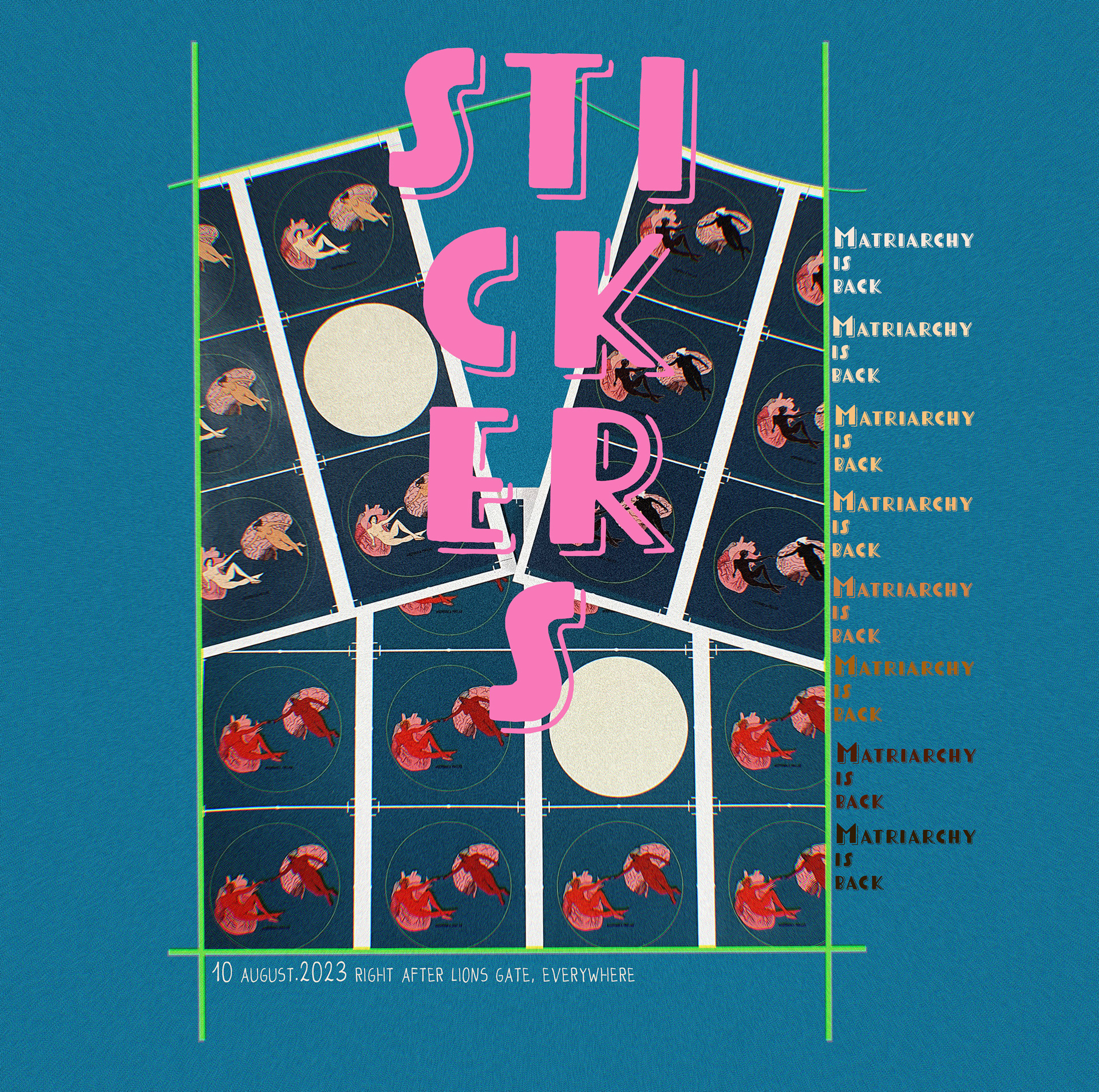
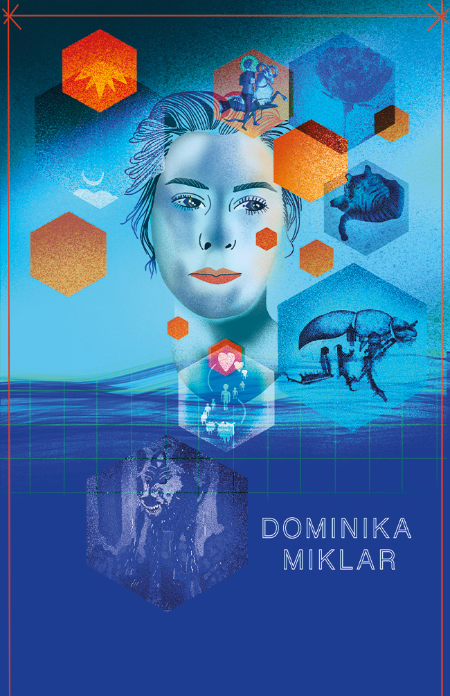
Informative poster for stickers campaign

Design for magnets : AKERSHUS FESTNING
The idea of this project is to focus on the protection of historic and cultural buildings by presenting them in an Inuktitut edition of small magnets. The colors are reminiscent of an old poster style from childhood, with warm, bright colors and a grain effect. The intention of this style is to recreate memories of the buildings that are still alive but could be turned into modern bureaucratic high-rises in the near future if society does not take responsibility for the surrounding city landscape.

Design for magnets :Youngstorget
The idea of this project is to focus on the protection of historic and cultural buildings by presenting them in an Inuktitut edition of small magnets. The colors are reminiscent of an old poster style from childhood, with warm, bright colors and a grain effect. The intention of this style is to recreate memories of the buildings that are still alive but could be turned into modern bureaucratic high-rises in the near future if society does not take responsibility for the surrounding city landscape.

Design for magnets : Jernbanetorget
The idea of this project is to focus on the protection of historic and cultural buildings by presenting them in an Inuktitut edition of small magnets. The colors are reminiscent of an old poster style from childhood, with warm, bright colors and a grain effect. The intention of this style is to recreate memories of the buildings that are still alive but could be turned into modern bureaucratic high-rises in the near future if society does not take responsibility for the surrounding city landscape.
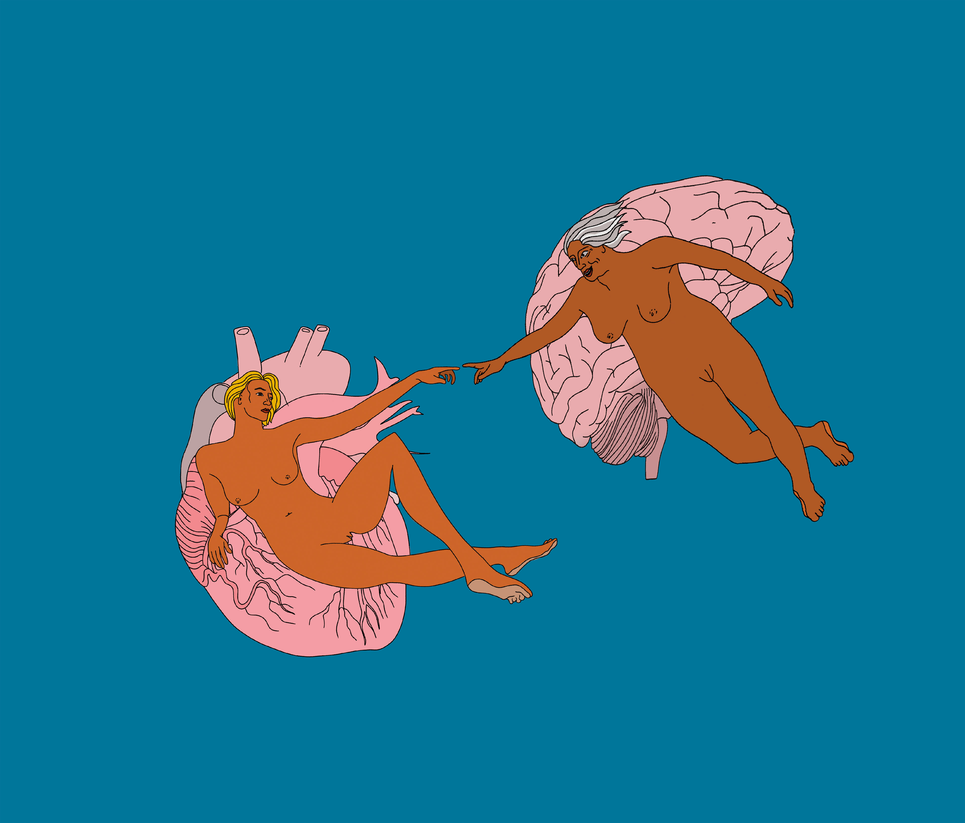
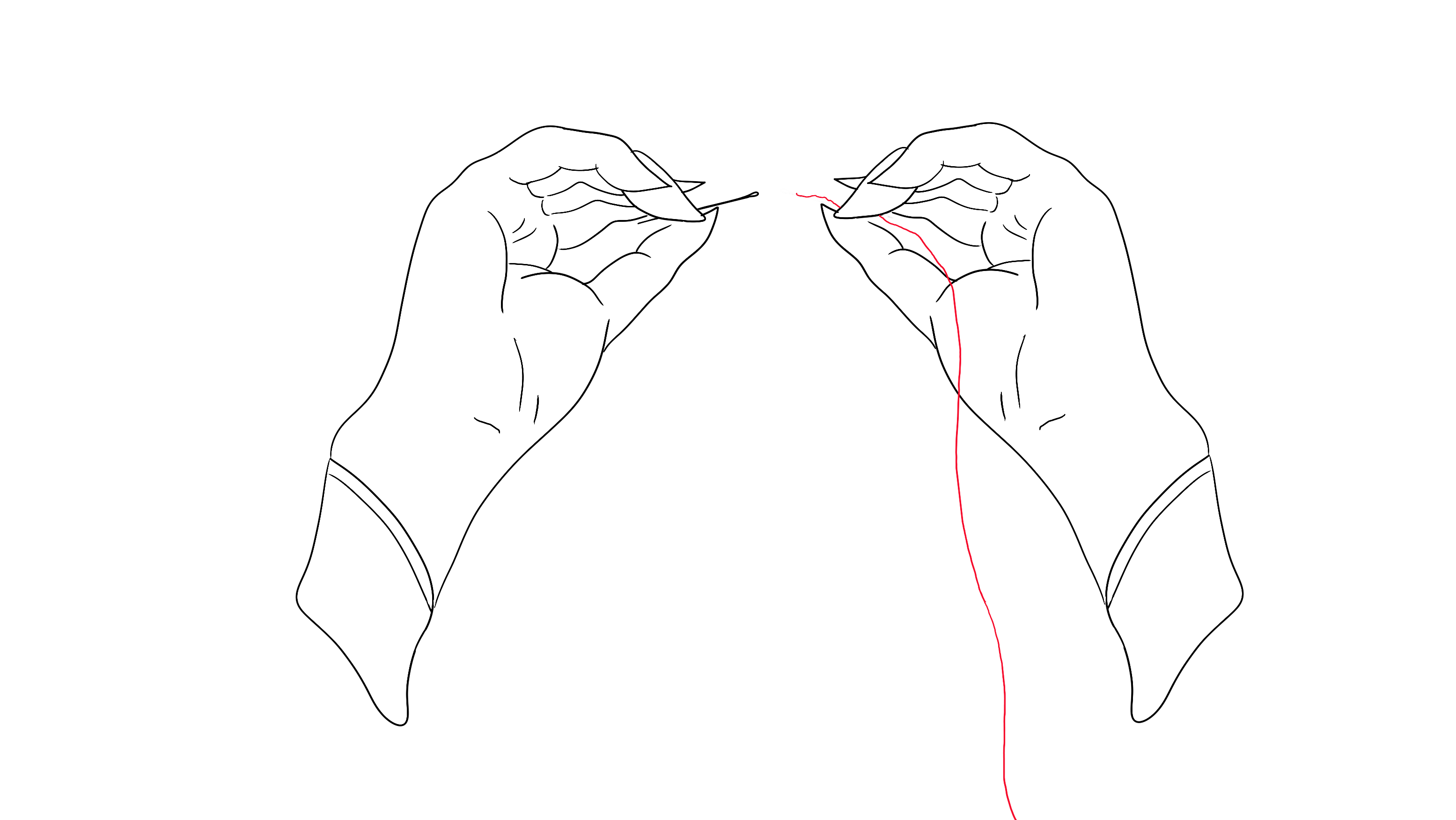
Presenting a character that is a part of the short animation: Matriarchy is Back
Matriarchy is Back began as a challenge I gave myself to use the beta version of Photoshop with built-in AI functionality. I started by altering an image of Michelangelo's painting "The Creation of Adam," hoping to transform Adam into Eve and God into a Goddess. However, the results were not satisfactory, so I decided to create a new illustration of Eve and the Goddess. From this illustration, I created an animation.
business card, front side